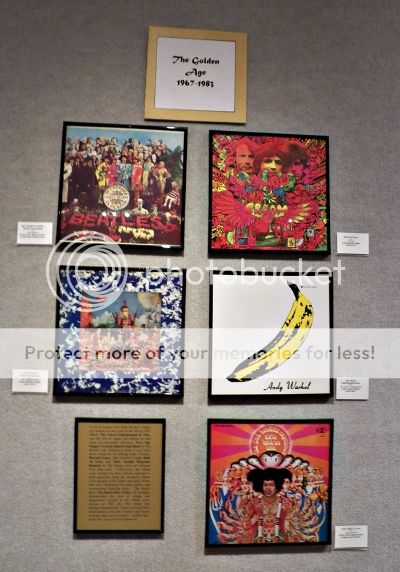
As the Sixties evolved so did album cover art, reflecting the rapidly-changing culture of the times.
That's the contention of Doug Sjoquist whose collection, "The Golden Age of Album Covers 1967-1983," graces the gallery at Escanaba's Bonifas Arts Center.
For most of the decade, albums usually featured artist portraits and conventional lettering, producing lackluster appeal. Sjoquist, retired humanities professor at Lansing Community College, described the product as "boring."
Then came 1967. Innovative album sleeves by the likes of The Beatles, Jimi Hendrix, Rolling Stones, Cream, Velvet Underground, Grateful Dead and King Crimson ushered in an era of extraordinary creativity that increasingly reflected the revolutionary music in the grooves of the records inside.
The use of portraiture declined and original artwork bloomed until the introduction of the compact disc when cover art shrunk to CD size.
A former instructor at Bay College, Sjoquist was a teenage drummer when he purchased "Disraeli Gears" and "Axis: Bold as Love." The stunning cover to "In the Court of the Crimson King" in 1969 prompted him into a lifetime of collecting album art.
"Sgt. Pepper's Lonely Hearts Club Band'' is also featured prominently in the display for its gatefold sleeve, printed lyrics and Hindu imagery.
Music fans will recognize many of the exhibit's covers including Santana's "Abraxas," another gatefold sleeve.
As his collection grew through the years, Sjoquist used it in teaching world civilization and history of rock music courses. He also said it was a good way to "illustrate the relationship between art history and popular culture." He made presentations of album cover art at national conventions in Traverse City, Las Vegas and Portland, Or.
The 80-cover exhibit is organized into sections emphasizing Africa, Asia, Europe and the Americas. There are two main themes, world cultures and art history.

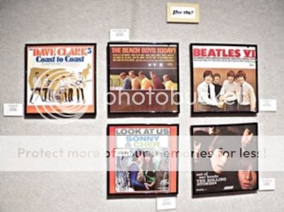
A handful of the albums illustrate the period before 1967, including the Beach Boys, Rolling Stones, Sonny and Cher, Dave Clark Five and Beatles' "VI," an American compilation record. Several other Fab Four covers, not shown in the display, may have under-recognized significance. "Rubber Soul" and "Revolver" strayed from the standard format.
The former album, issued in 1965, presented a distorted photograph of the group with bubble-shaped letters, designed by Charles Front, forming the title. The group's name did not appear on the cover.
Artwork designed by bassist and mop-top friend Klaus Voormann fronted the following year's release. His cover collage was a combination of photos and drawings quite unlike any cover of the period. Intentionally black and white, the band's moniker was absent again.
"I'm convinced anyone interested in art history, world civilizations, world religions, and pop culture would find this exhibit aesthetically pleasing and educational," Sjoquist said in a rationale and brief history of his exhibit.
We agree.


 I've enjoyed rock music and writing since I was a teenager in the 60s. I feel lucky to have been around when rock's greatest stars created their most enduring hits. At the same time I found I enjoyed writing, as well. I worked on my high school newspaper and magazine, was editor of several college publications and earned a bachelor's degree from Central Michigan University in 1973. I worked for the daily newspaper in my hometown after graduating, becoming managing editor after a few years. By the 1980s, I moved into public relations. In 1985, my wife Sue and I opened a retail music store, The Record Rack, which we still own. Rock 'n' roll has been integral to me and for the last 2O years I've been earning my living from it even though I don't have a musical bone in my body. In recent years, I've also I edited a small local magazine and launched a micro FM radio station. Now, I'm finally combining my love of writing and rock 'n' roll. I can't sing a note, but I know what I like. I'll tell you all about it when you read on. I hope you have as much enjoyment reading these installments as I've had writing them.


No comments:
Post a Comment